BRANDING BOARDS
- Aug 20, 2018
- 1 min read
Good Day everyone!
So below i have designed and constructed 3 branding material boards that compliment my previous post on my branding post, as a brand i do love simplistic logos, i personally think they look clean and professional yet sleek.

^ above is my first branding logo which is on a white card, with a black raised gloss logo.
^ my second design is a different to the first, it involves a more playful tone and is quite cute. I like the texture of the polka dots and the nude centre.

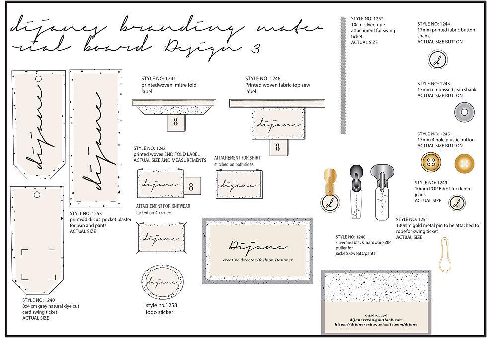
^ the third design i created was with a black and white pain medium, i love the look of different mediums on a logo, i think it is artistic yet with a different colours it can describe what tone the brand represents, to my i like the look of the black and white paint, yet looks different with each label. On the smaller labels i have added a nude (or what can be available) so the brand logo can be seen clearly.
If you have any suggestions, feel free to comment below any suggestions or ideas you all might like to add!
Have a beautiful night xo


Comments